
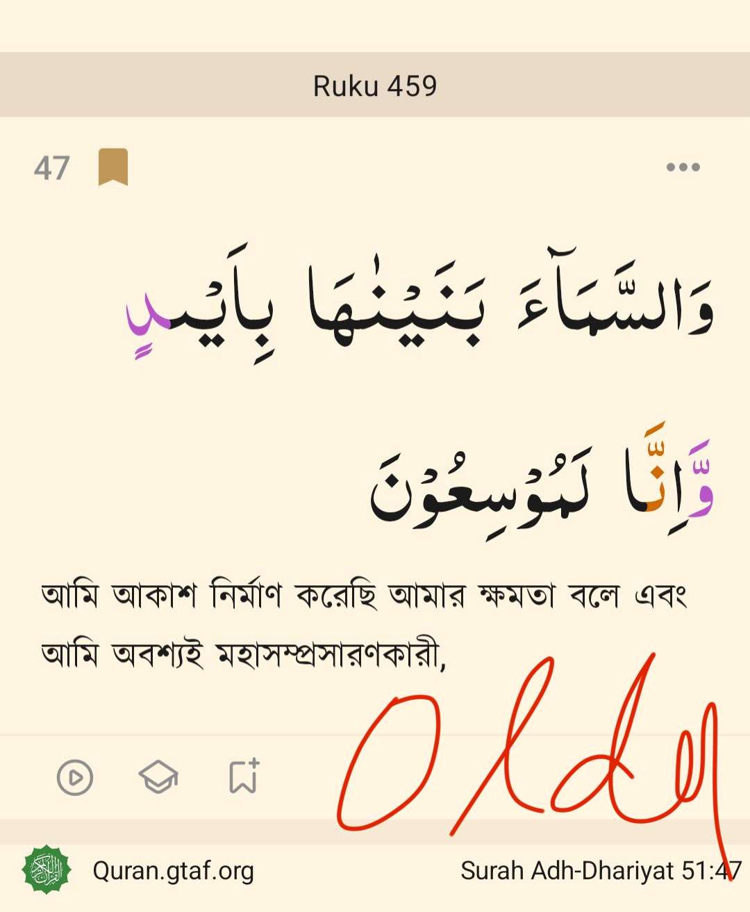
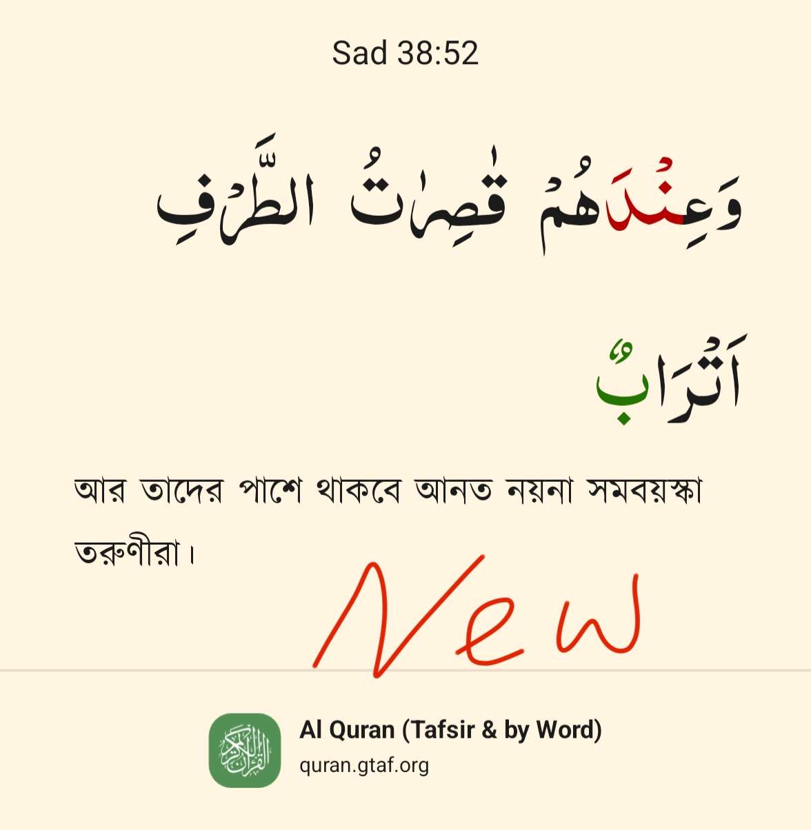
Feedback: new design worse than old (word by word, font, spacing)
🔸শব্দে শব্দে ফিলিং চলে গেছে।
🔸Font size ছোট হয়েছে।
🔸আগেরটিতে কোনো ভুল ছিল এমন
মনে হয়নি।
🔸Blank space বেড়েছে।
🔸3 dot থাকলে shared person এর
আকর্ষণ তৈরি হতে পারে।
----------------------------------
🔹Word by Word feeling has been
distinguished
🔹Font size has decreased
🔹We couldn't realize that
something was wrong in the
older style except the bookmark
symbols appearance.
🔹Blank space increased
🔹The previous style was more
attractive
Pending